 I chose this TOC concept because I liked that it looks clean and simple but still allows you to add elements such as pictures to make it stand out more.  I chose this TOC concept because I felt that it looks modern and simple but still has elements such as the bold numbers to make it more creative looking. 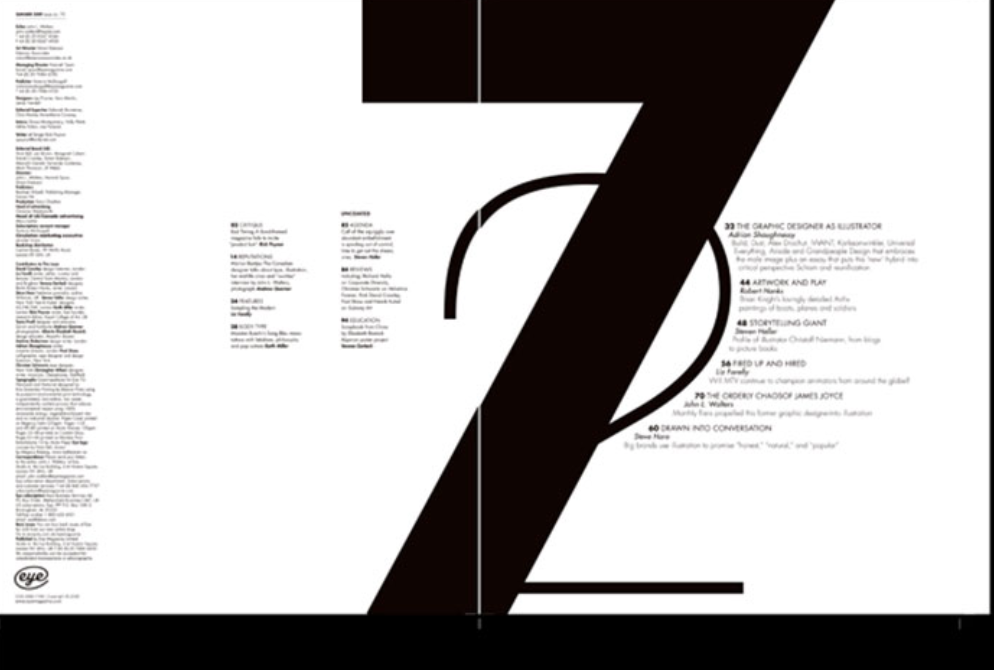 I chose this TOC concept because I thought that it was very sleek and simple looking while still having an original and creative design to it. All three TOC concepts match my front page concept because I tried to make my magazine cover very simple and refined yet modern looking. I feel like each of these TOC's represent that in their own ways. Possible article topics (as seen on my mockup magazine cover) could be on New York Fashion Week 2020, Waldorf Designs' fashion show, and Blair Waldorf.
0 Comments
Notes -camera pans in the beginning to set the scene -full view of body -music creates suspense -gloomy lighting -dull colors -the sound is quiet and faint -there is pause before bleeding Write up Camerawork: The camera person angled the shots in a way that would allow the audience to feel as if they were there themselves. When Lester hits a hammer at his wife’s head, the camera does a close up on her face to make it more dramatic. There was then a downward angle used to show her dead on the floor. An eye-level angle was used to capture the rest of the film to show what Lester’s next moves are. Sound: To heighten the suspense dramatic music is added to the film. There were also a variety of sound effects, for example, the sound made when Lester hits his wife or the sound made by the laundry machine to indicate something was wrong. Use of Mise-en-scene: The main act occurred in the basement with dull and subtle lighting to indicate something bad was going to happen. Additionally, the lighting throughout the house was also dull and yellow-tinted to indicate a darker mood. The director most likely chose these details to make the audience aware that a problem was going to occur. Editing: The majority of the edits in this film were made when Lester’s wife began to bleed after being struck by the hammer. When she is first hit, no blood is shown, but in the next clip it cuts to, you see blood begin to rush. The next edit shows her falling to the ground when the blow from the hammer ends up killing her. Compare/Contrast
In both my response and in the example, we highlighted the emphasis on the dull lighting and overall dark and gloomy tone of the film. Additionally, we both discussed how the suspenseful music and choice of colors added to the dark tone. The biggest difference between the example response and my own is the fact that they provided more examples when it came to usage of camerawork and specific details in the film. When describing the darkness of the tone, I gave more generic examples to support my response while they pinpointed moments and details. 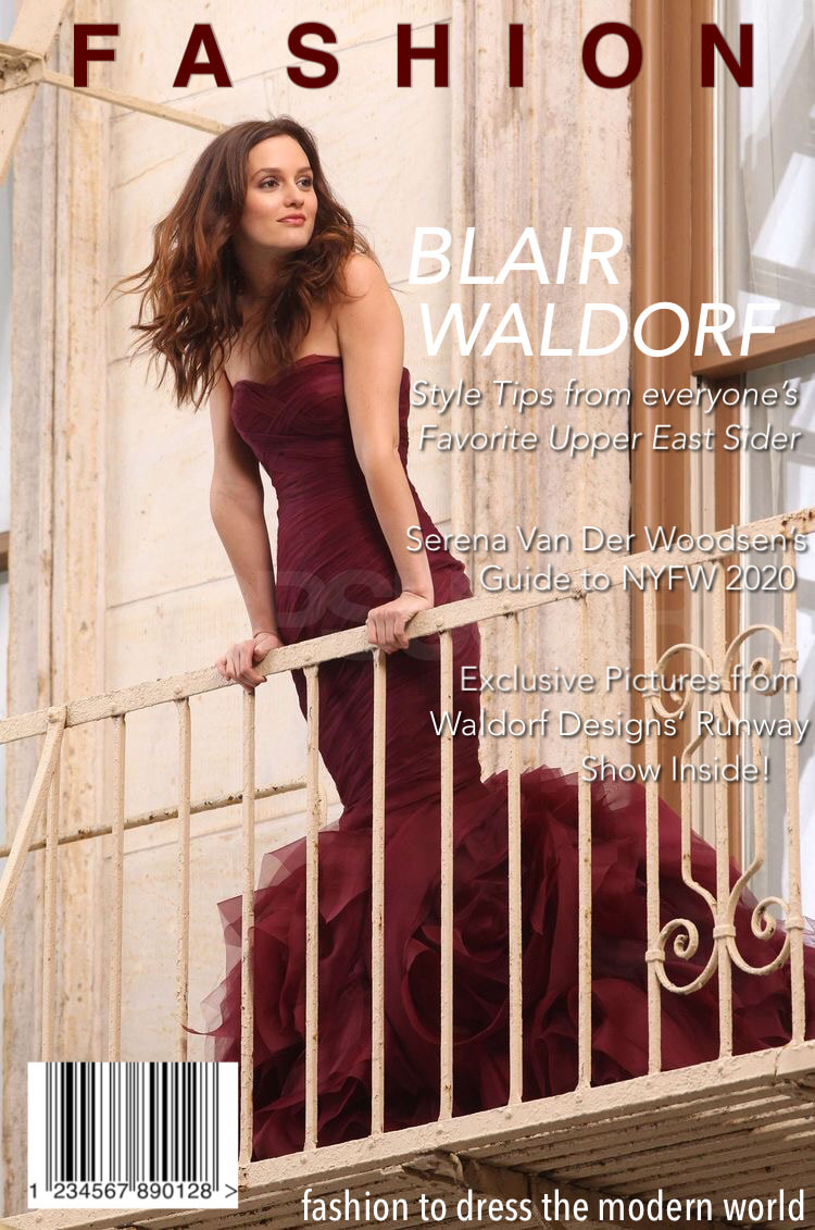 title/masthead: I used "fashion" to represent a basic and straightforward title to indicate what my magazine is about.
typography: I tried to set a tone or mood of sophistication and elegance by making the fonts simple and sleek. They are also arranged in a very clean and organized way to further set the tone. image: The image I chose is of Blair Waldorf from "Gossip Girl" who is known to be a fashion icon. She is pictured wearing an elegant dress and is posed to appear confident. language: The strapline is "fashion to dress the modern world" to suggest to readers that both the material and the reader are very up to date and with the times. The editorials and features all include what seems to be exclusive content by well renown fashion influencers. |
AuthorWrite something about yourself. No need to be fancy, just an overview. Archives
April 2021
Categories |
 RSS Feed
